Conceptual typography poster prompt: the title is the artwork
A typography poster prompt that treats the title as the artwork: weight, distortion and whitespace all serve the meaning — a new title is the only edit.
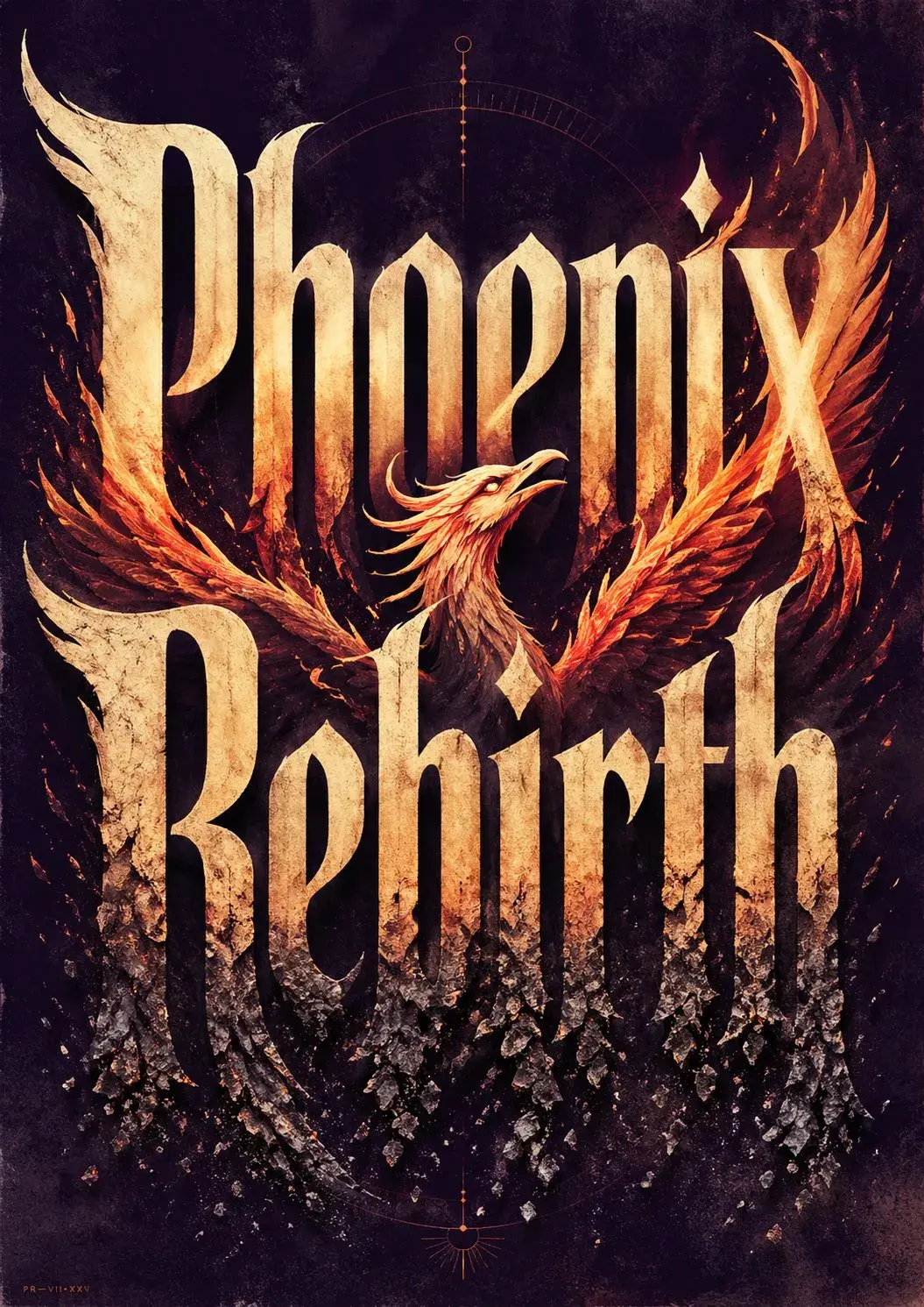
ModelsGPT Image 2
The prompt
Create ONE finished premium conceptual typography poster for the exact title:
"[INPUT_TEXT]"
Single poster only. No moodboard, grid, presentation board, mockup, captions, prompt text, process sheet, or sample labels.
The title "[INPUT_TEXT]" must be the dominant visual structure of the poster: huge, readable, powerful, and spelled exactly. Do not translate, shorten, replace, or misspell it. Do not add other large readable text. Optional micro catalog text is allowed only if it stays subtle and secondary.
Silently interpret the title's meaning, mood, cultural aura, symbolic associations, psychological tension, and visual rhythm. Turn that interpretation into one strong visual metaphor.
Typography is the hero. Design custom-looking letterforms whose weight, width, contrast, spacing, rhythm, distortion, negative space, edge quality, and ink texture express the temperament of the title. The type should feel intentionally designed, not like a default font.
If "[INPUT_TEXT]" refers to a widely known person, make a large editorial portrait or full/half-body figure a major visual presence, occupying roughly 40–70% of the composition. The figure should feel recognizable through aura, posture, styling, era, expression, lighting, and symbolic atmosphere, but should not copy a specific existing photograph, official poster, campaign image, logo, slogan, or copyrighted composition. The portrait must interact with the typography: overlapping the letters, emerging from them, being framed by them, casting shadows on them, breaking through them, or being partially hidden behind them.
For all other titles, use a human figure, landscape, object, or atmospheric setting only when it strengthens the meaning. It must interact with the typography and deepen the concept, not decorate it.
Use a rich but restrained 4–6 color system matched to the theme: dominant background color, primary typography color, figure/landscape tone, emotional accent color, muted support color, and subtle paper/ink texture tone. Avoid flat black-white-red defaults unless conceptually necessary.
Composition style: high-end editorial poster, museum-quality graphic design, dramatic scale, strong hierarchy, few elements, intelligent whitespace, bold flat color areas, sharp cropping, silkscreen/lithograph/risograph grain, paper fibers, subtle ink imperfections, refined visual tension.
The final image should feel like a complete visual sentence: the title, the figure or setting, the color, and the typography explain each other.
Avoid generic word art, glossy 3D lettering, random icons, stock-photo realism, cluttered collage, excessive grunge, tourist clichés, official logos, copied slogans, copied campaign aesthetics, unrelated text, and misspelled typography.The lazy version of a type poster is “make the word huge and impactful”, and it always lands as word art. This prompt instead makes the title explain itself: read what the title means and feels like, then put every type parameter in service of that reading.
- Interpretation comes before image. “Silently interpret the title’s meaning, mood, symbolic associations” upgrades the job from typesetting to concept.
- New title, new poster. Everything hangs on the single
[INPUT_TEXT]placeholder, so the template lifts out whole. - Figure–type relations are written as actions: overlap, emerge, frame, cast shadows, break through — the model gets executable ways to interact.
Details worth keeping
- “Spelled exactly” leads the first paragraph — misspelling is where type posters die first.
- When the title is a famous name, the prompt switches to an editorial portrait (40–70% of the frame) and explicitly forbids copying existing photos; recognition comes from aura and posture.
- The 4–6 color system blocks the black-white-red reflex, and the silkscreen/risograph grain buys the printed-matter texture.
- The original case was first posted by @xiaoxiaodong01 and amplified by @dotey on X; the prompt here is curated from the open-source repo freestylefly/awesome-gpt-image-2 (MIT license), and the example image is the case’s own Phoenix Rebirth render. Source material comes from the open community; rights holders can ask us to take it down at any time.
- For type as the hero in motion, see our motion showreel prompt.