Semi Design: ByteDance's open-source React component library
Semi Design is ByteDance's React component library: a Figma plugin turns mockups into code, and the DSM platform manages 2,700+ design tokens.
Project facts
GitHub Ecosystem- License
- MIT
- Language
- TypeScript
- Stars
- 10,453
- Data checked
- 2026-11-01
Snapshot figures reflect the check date and may change over time.
Every admin-panel project starts the same way: tables, forms, modals, navigation — a week gone before any business logic exists. Semi Design is a React component library and design system from ByteDance’s Douyin frontend team that ships that foundation: over 60 ready components with more than 8,000 variants, from data tables to calendars. The repository had 10,453 stars on November 1, 2026, is MIT-licensed, and written in TypeScript. It powers products inside ByteDance, and outside projects can start with npm install @douyinfe/semi-ui.
Core features
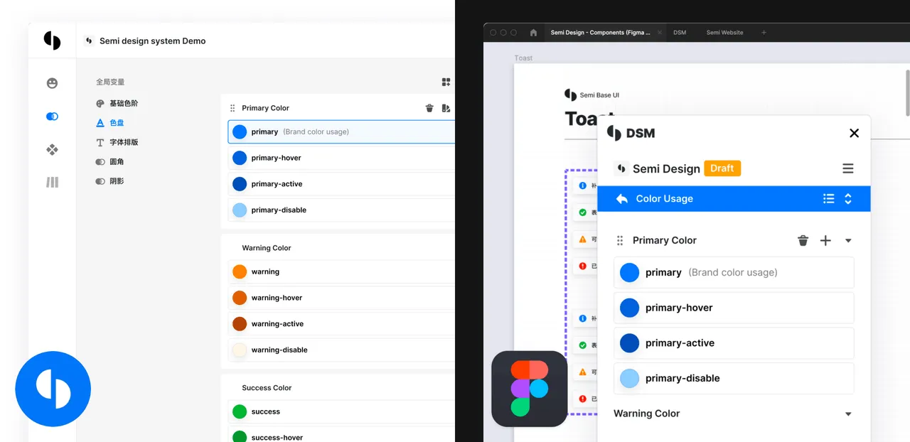
Semi’s most distinctive feature is how it connects design work to code. Designers compose screens in Figma using the official Semi UI kit, and a Figma plugin converts those mockups into real React components, narrowing the gap between the design file and the shipped product. Theming lives in DSM (Design System Management), a web platform where more than 2,700 design tokens control colors, radii, and typography — restyling for a brand means editing tokens, not overriding component CSS. The screenshot above shows DSM’s token editor.
Typical use cases
Components implement W3C keyboard interaction and focus management, every component supports right-to-left layouts, and the built-in i18n layer covers more than 50 languages. For internal tools serving international or government users, that removes a full pass of compliance and per-page adaptation. TypeScript types are complete, server-side rendering works out of the box, and each component’s docs page pairs live-editable demos with the accessibility notes — designers and engineers end up reading the same vocabulary.
This is a strong fit for admin panels, dashboards, and internal tools where design files and code must stay in sync; less so for marketing sites, where a lighter library without a design-system layer is usually enough.
Quick start
Install and import a component:
npm install @douyinfe/semi-ui
import React from 'react';
import { Button } from '@douyinfe/semi-ui';

const App = () => <Button type="primary">Hello</Button>;
The docs and live playground live at semi.design — every component page has editable props — and the Figma UI kit is searchable in the Figma Community. For questions, GitHub Discussions sees regular activity alongside a healthy npm download count. If you want a full admin layout to copy rather than components to compose, compare Shadcn Admin — Semi gives you the design system, Shadcn Admin gives you ready-made pages.
Summary
Semi Design fits React teams building admin panels who would rather not rebuild tables and forms from scratch — especially when design files and code need to stay in sync. Two caveats: it is ByteDance-led open source, so issue response depends on the community, and the components carry their own visual language; check whether DSM’s tokens cover your brand before committing to deep customization. GitHub data verified November 1, 2026.