Site builders#Coding agent#UI design
Solid Glass: a restrained glass-like theme for shadcn/ui AI interfaces
Solid Glass is an MIT-licensed shadcn/ui stylesheet from DeepLethe that gives AI chat and agent UIs a restrained, glass-like finish, plus agent components.
Project facts
GitHub Ecosystem- License
- MIT
- Language
- TypeScript
- Stars
- 2,231
- Data checked
- 2026-10-19
Snapshot figures reflect the check date and may change over time.
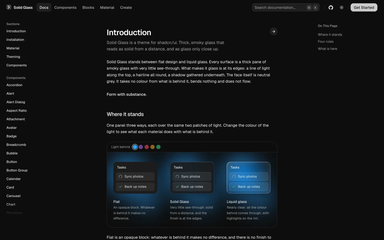
Interfaces for AI products run into the same trouble. Replies stream in, agents run tools in the background, and decisions wait for someone to click, so a busy surface makes the reader fight the background for every word. Solid Glass is a shadcn/ui theme from DeepLethe that tries to settle this. It sits between flat design and liquid glass: a thick pane with very little see-through, where only an outline comes through. The whole theme is one stylesheet that finds each part of a shadcn/ui component through the data-slot attributes and classes the component already has. The repository was created on October 12, 2026, uses the MIT license, is primarily TypeScript, and had 2,231 stars on October 19, 2026.
Core features
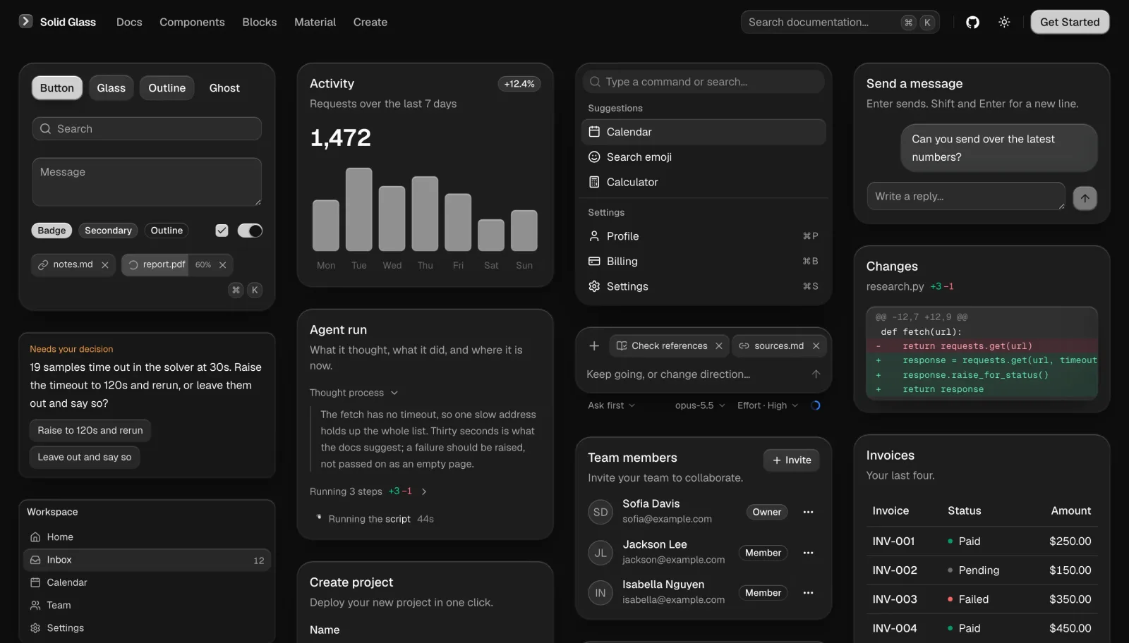
- One stylesheet, no component changes: the theme relies on
data-slotattributes and the classes shadcn/ui already applies, so components you already have need no edits. - Three glass thicknesses and one state: colours, the three thicknesses, a single state and motion all live in
src/solid-glass.css. - Components for agent interfaces:
status-glyphshows a turn in progress as three points of light.turn-status,composer,tool-steps,diff-view,ask-card,context-ring,task-noticeandreasoningcover status lines, input boxes, tool steps, diffs, questions, context use, task notices and visible reasoning. - A Create page with the dials visible: thickness, tint, chart colour, type, radius, edge and blur, with a live preview and the few lines of CSS that result.
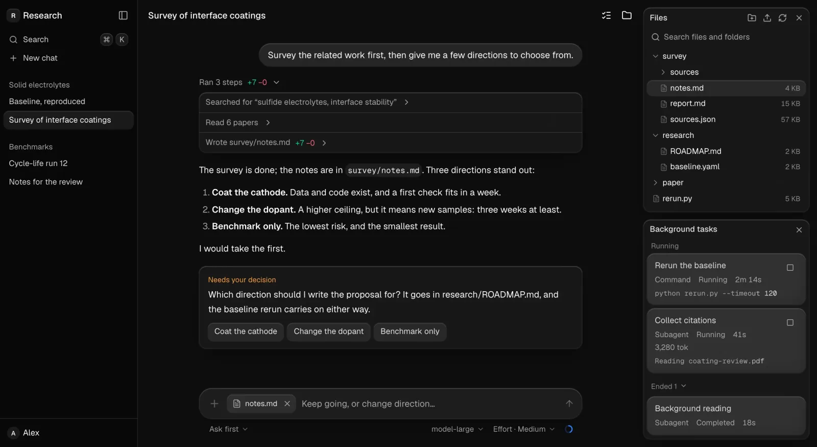
- Blocks as whole screens:
agent-workspaceis built from the components and shows sessions, the conversation thread, files and background tasks.
The README explains the reasoning. AI products change constantly: replies stream in, agents run tasks, and decisions wait for a person. So Solid Glass keeps the interface calm, with neutral surfaces that cut distraction, depth that sets hierarchy, and colour and motion kept for meaningful feedback. The theme is written in lightweight CSS and works with existing shadcn/ui components in light and dark modes.
Typical use cases
- Agent workbenches and AI chat front ends: teams that stream text and show tool steps, questions and context usage on one screen.
- Products already on shadcn/ui: a new visual base without rewriting components. The README asks you to delete the
:rootand.darkcolour variables thatshadcn initwrote, because the stylesheet defines the same names. - Evaluation before adoption: the live site has Blocks and Create pages, so you can judge the look without installing anything.
If you want to generate interface structure from text first, see OpenUI. Solid Glass solves a different problem: it changes the material of an interface that is already built with shadcn/ui.
Quick start
The README starts with a shadcn/ui project, then adds the stylesheet:
npx shadcn@latest init
npx shadcn@latest add deeplethe/solid-glass/solid-glass
Import ./solid-glass.css after Tailwind and shadcn’s stylesheet. To browse the documentation locally, clone the repository, run npm install and npm run dev, then open http://localhost:5191.
Summary
Solid Glass suits teams already on shadcn/ui, React 19 and Tailwind CSS 4 who want a restrained, readable base for AI interfaces. It does not suit projects without that stack, or teams that need to keep their existing colour variables. Two things to watch. The repository is about a week old, so check the current README and component list before committing. And the stylesheet uses the same colour variable names that shadcn/ui writes, so it overrides :root and .dark, and existing colour settings need to move first. MIT licensed, primarily TypeScript.