oil-ui: make your agent compare UI directions before it builds the page
oil-ui is an MIT-licensed UI design skill by oil-oil: the agent sets a tone, studies category peers, then builds distinct previews on one page for you to pick.
Skill details
npx skills add oil-oil/oil-ui --skill oil-ui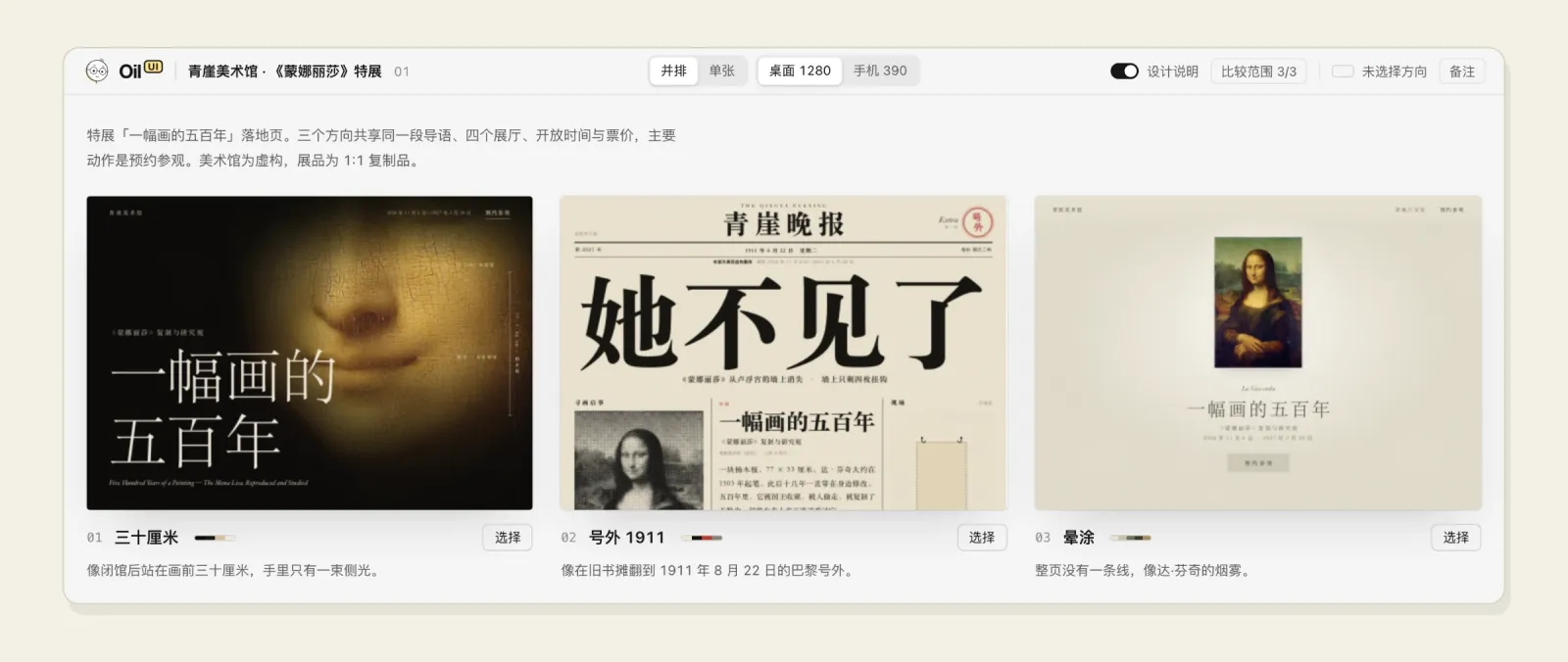
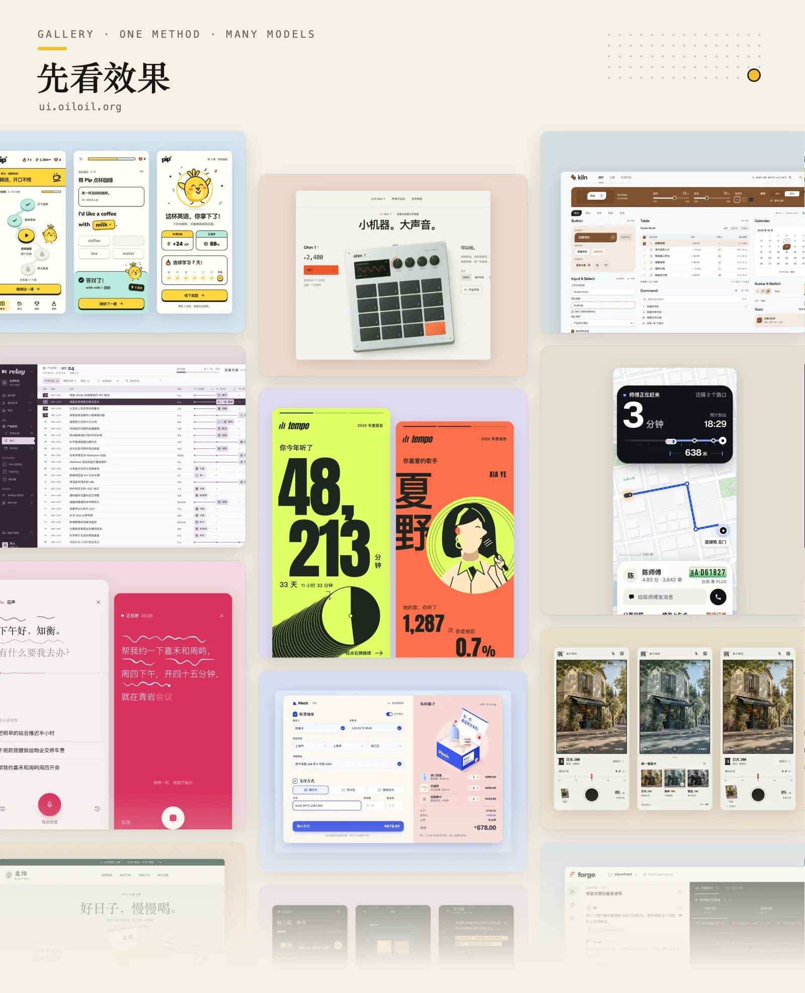
Ask an agent for a page and you tend to get the same one: a purple gradient, a centered headline, three rounded cards. oil-ui is an open-source UI design skill from oil-oil on GitHub (MIT license, repo created September 30, 2026, currently version 0.16.0). Instead of letting the agent start coding, it makes the agent identify the product category, set a tone, and put several clearly different directions on one page for you to choose from. As of October 6, 2026 the repo has about 661 stars, and the gallery at ui.oiloil.org shows finished results.
The order oil-ui works in
oil-ui’s SKILL.md splits a design task into five steps: explore and converge on a direction, build the visual and interaction structure, produce real evidence, run an independent review, then verify and deliver. The first three set it apart from other design skills.
oil-ui starts by identifying the category. The agent names the product, finds two or three peers with the most distinctive styles, studies why they made their choices, and only then decides what to keep and what to change. Next it sets the tone on five scales: energy, polish, density, visual weight and seriousness, turning words like “premium” or “clean” into visible decisions about type, white space and how much of the page color covers. Only after that does it propose directions, each starting from something concrete such as a material in a setting, a scene, or the visual language of another field, rather than from adjectives like “minimal” or “bold”.
Compare side by side
oil-ui’s main artifact is a style comparison page. Several previews sit together, you can switch between a 1280 px desktop and a 390 px mobile width, open one at full size, and flip through with the arrow keys. When one wins, you click Select, the page copies a sentence, and you paste it back to the agent so it continues from there.
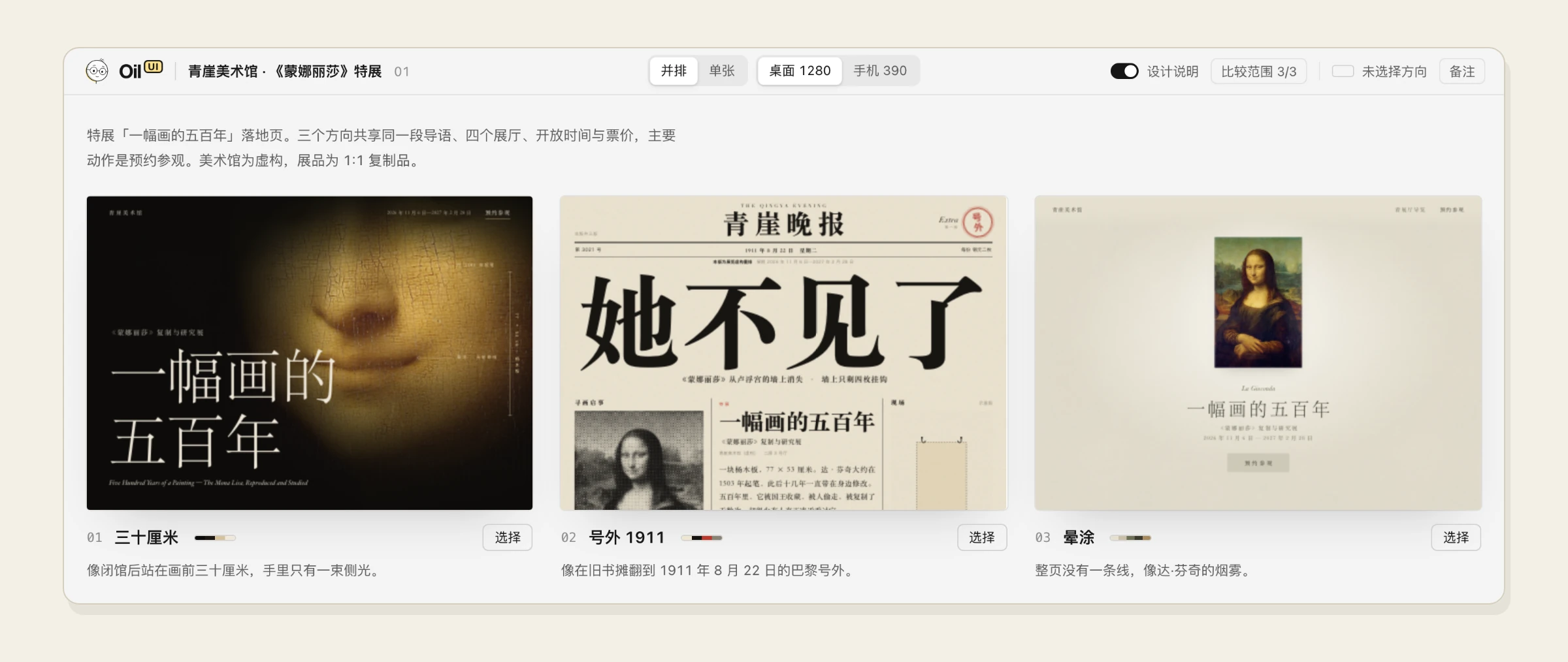
To keep the previews from being one layout in three colors, oil-ui sets a hard rule: across layout, typography, color and key imagery, any two directions may share at most one. Once the previews exist, it asks the agent to squint at the opening screens side by side and pick a new layout if the light and dark shapes look alike. It also asks who the opening screen is for. A page people browse or work in leads with the content itself; only a page meant to persuade gets a chosen layout, a wireframe, and then copy.
What it covers and what it skips
- Scope: design judgment only, meaning hierarchy, type, color, spacing, imagery and motion. Component ownership, data flow, state correctness and tests are out of scope.
- Small edits: a spacing or color tweak is made directly, with no directions and no review.
- Verification: screenshots at desktop and mobile sizes, plus a recording or start, middle and end frames for motion. A static image doesn’t count.
- Review: the open-source version runs one independent review per stage by someone who hasn’t seen the work in progress; without an isolated reviewer the agent self-checks and says so.
- Subtraction: a final pass leaves one focal point per page and removes copy and containers that don’t help.
Open-source version versus Pro
The open-source oil-ui needs no extra API key and no other skills. It covers tone-setting, the comparison page, hierarchy, type, color, imagery, motion, screenshot recreation and a review of polished existing UI. Interaction and state design, dashboard layouts, light-trail and dot-pattern effects, and the check for clashing directions belong to the paid Oil UI Pro. The README lists it at 69 yuan as a one-time purchase on ui.oiloil.org/pro. Installing both makes them compete for the same requests, so skip the open-source version if you have Pro.
Who it’s for
Anyone who often asks an agent for landing pages, brand pages or app screens and keeps getting the same look back can try it. It splits the work differently from impeccable, which polishes existing UI with 24 commands and a detector for AI tells, while oil-ui compares directions before building. For Anthropic’s baseline, see frontend-design.
Three things to know before installing. First, each use triggers a version check, at most once every 10 minutes, skipped after 2 seconds, reading only the public version list on ui.oiloil.org without uploading project content; it needs Python 3, and OIL_NO_UPDATE_CHECK=1 turns it off. Second, it only announces new versions and never replaces the skill on its own. Third, the author has tested it only on macOS; Windows and Linux are unverified.