Looseleaf: shadcn/ui components drawn by hand
Looseleaf is Kevin Ngo's open-source React library: 123 accessible components that keep shadcn/ui's parts and props, redrawn as hand-drawn paper UI under MIT.
Project facts
GitHub Ecosystem- License
- MIT
- Language
- TypeScript
- Stars
- 305
- Data checked
- 2026-11-04
Snapshot figures reflect the check date and may change over time.
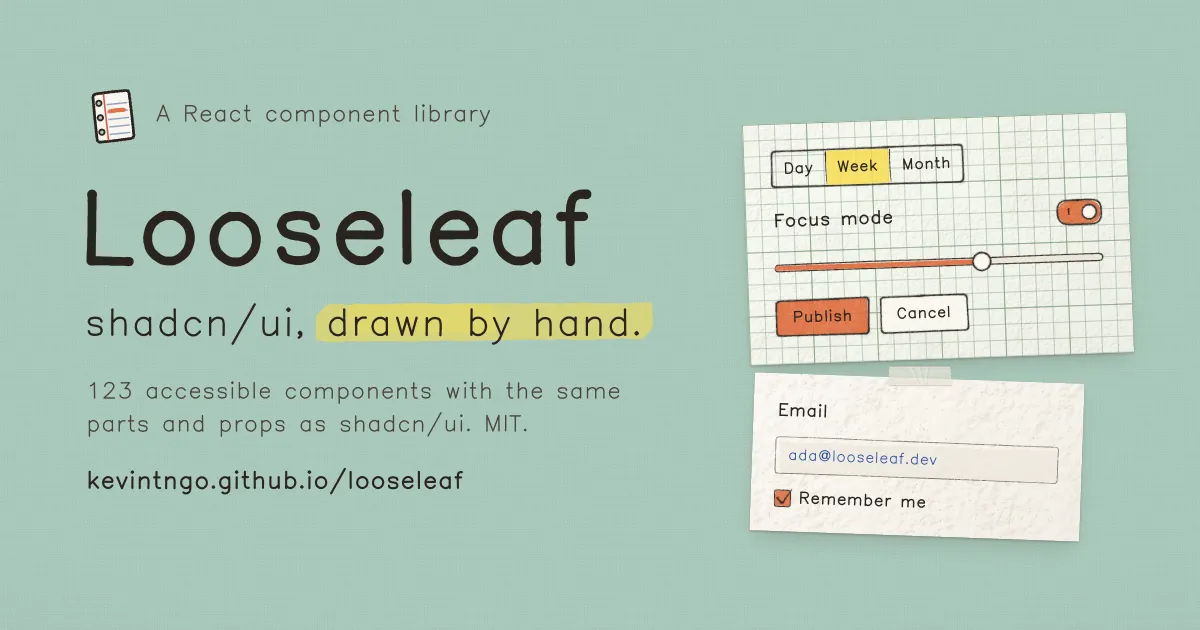
Most shadcn/ui dashboards look alike, and some products — kids’ apps, education tools, personal sites — want the warmth of paper without giving up Radix-grade accessibility or the shadcn component workflow. Kevin Ngo’s Looseleaf (MIT) is built for exactly that spot: 123 components covering every shadcn/ui part, from button to sidebar to chart, keeping the same parts, props and data-slot names, so your JSX stays untouched and swapping the registry reskins the app as hand-drawn paper UI. The repo was created November 1, 2026 and sat at 305 stars as of November 4; the full library is browsable at kevintngo.github.io/looseleaf, and jQueryScript’s write-up calls it the most complete hand-drawn shadcn-style registry so far.
Core features
- Drop-in shadcn/ui replacement: keeps shadcn/ui’s parts, props and
data-slotnames on React + Tailwind v4 + Radix, so the accessibility semantics survive the reskin and existing projects swap registries, not code. - 123 components, 61 blocks: every shadcn/ui part plus paper objects, marks, stickers, a sketchpad and a chat kit; blocks cover logins, sign-ups, dashboards, settings, pricing, chat and landing sections, ready to copy as a set.
- All art drawn in code: 160 icons, 48 doodles, 88 stickers, badges and stamps, and the mascot Stubby in 15 poses are drawn programmatically rather than shipped as bitmaps, so they scale and recolor cleanly.
- Kevin Sans typeface: one hand-drawn font bundled with the theme, tuned separately for interface text, titles and stamps.
- Accessibility kept intact: keyboard support, visible focus, AA text contrast, 24 px targets, reduced motion, forced colors, RTL and three densities are default behavior, not add-ons.
Typical use cases
- Re-skinning a light product: education tools, note-taking apps and personal brands that want an interface that doesn’t read as a template, while keeping standard Radix semantics underneath.
- Decorating content pages: skip the full reskin and take just the stickers, stamps, polaroid frames and signature pad for landing pages and empty states.
- Copying proven layouts: the 61 blocks are ready-made login, pricing, dashboard and chat compositions, added the same way as shadcn blocks and then edited.
Quick start
Add the registry to your project’s components.json once:
{
  "registries": {
    "@looseleaf": "https://kevintngo.github.io/looseleaf/r/{name}.json"
  }
}
Then add what you need:
npx shadcn@latest add @looseleaf/button
npx shadcn@latest add @looseleaf/login-01
npx shadcn@latest add @looseleaf/looseleaf
Components land in your repo as source (components/ui/*.tsx, lib/ink/*) — your code, not a runtime dependency. The theme brings Kevin Sans with it, and a standalone CSS import exists if you’d rather load the font by hand.
Summary
Looseleaf fits front-end developers and indie hackers already on shadcn/ui who want a hand-drawn paper look; dense enterprise dashboards and neutral corporate design systems won’t enjoy sketch outlines competing with their data. Facts and limits: MIT-licensed TypeScript, components delivered as source you own; the repo is four days old as of this writing (created November 1, 2026, 305 stars by November 4), so expect the API and component list to move. The art style and Kevin Sans are designed for Latin text — CJK interfaces need their own font pairing. Sketchcn takes a rough.js route to the same aesthetic; Looseleaf’s difference is covering the full shadcn/ui catalog plus paper objects, blocks and a bundled typeface. We previously covered unslop, which de-AI-ifies an existing interface, and ux-ui-agent-skills, which gates agent-built UI with 52 checks — Looseleaf attacks the problem one layer down, at the component source itself.