WeChat ships its first two-pane layout for iPhone Duo; Apple asks developers how to unsqueeze Safari on the outer display
WeChat 8.0.80 brings a two-pane chat layout to the iPhone Duo as tablet login rolls out; WebKit explains Safari's 382 px outer-display squeeze.
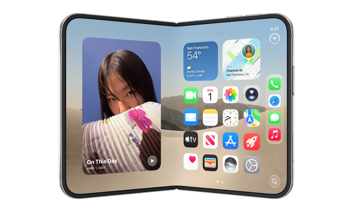
Two tracks of iPhone Duo adaptation moved on the same days this week. On October 24, the Chinese tech outlet MyDrivers published hands-on testing of WeChat’s iOS 8.0.80 update, which turns the messaging app’s inner-display view from a phone-shaped window with black bars into a two-pane layout — conversation list on the left, chat on the right — and starts rolling out tablet-style multi-device login to some users. A day earlier, on October 23, WebKit designer Jen Simmons published an official post explaining why Safari pages on the Duo’s outer display are stuck at 382 CSS px wide, and asking developers for better ideas. The iPhone Duo is Apple’s first folding iPhone: a 7.6-inch inner display, a 5.4-inch cover screen, on sale since October 23 from $1,999. One day into the sale, filling those two screens well is already a job shared by the platform and its apps — WeChat is playing catch-up while WebKit writes the rules.
Key points
- WeChat 8.0.80 adapts the inner display for the first time: side-by-side panes replace the centered window with black bars. The right-edge navigation is still inset, and landscape swipe-back does not work yet (MyDrivers hands-on, October 24).
- Tablet-style login is a staged rollout. A “use on other devices simultaneously” option appears at login; confirming on a second phone shows a “Log in to tablet” prompt naming the iPhone Duo. MyDrivers notes some users have not received it — “probably still rolling out gradually” — and Tencent has posted no announcement.
- WebKit published the numbers: 382 CSS px wide in outer portrait, as short as 368 CSS px in outer landscape. Because many sites “fail to inset all four edges correctly,”
viewport-fit=coverstays off; the Device Posture and Viewport Segments APIs ship as flagged developer previews.
Background
The adaptation story of the Duo’s first days on sale is one continuous line. On October 22, Apple started badging App Store listings “Made for iPhone Duo”; as we covered at the time, the trigger is simply submitting Duo screenshots in App Store Connect, and from April 2027 those screenshots become mandatory for submissions. The phone went on sale in 70-plus countries on October 23, and apps have followed in waves: WeChat’s two-pane view, sidebars in Alipay and Taobao, and now WebKit putting the platform’s viewport constraints on the table with exact numbers. App adaptation is a weeks-long relay; this entry covers the second leg.
WeChat’s two changes
Per MyDrivers’ October 24 hands-on, WeChat iOS 8.0.80 “adds inner-display adaptation for the first time.” Before the update, WeChat on the unfolded inner display was a centered portrait window with wide black bars on both sides; now it lays out as a two-pane messaging app, list left and conversation right. The adaptation is explicitly transitional: the right-side navigation strip still carries a black inset, the bottom control bar has not moved to the side, and edge-swipe back does not work in landscape. MyDrivers calls it a stopgap.
The second change is at login. In testing, the WeChat login screen offered “use on other devices simultaneously”; after confirming, a second phone showed a “Log in to tablet” prompt with the device name iPhone Duo. In other words, the Duo now gets tablet-class treatment — one account, phone and Duo online at once. Android foldables have had this for years, and its absence was one of the loudest complaints at launch. The caveats matter: some users still see no such option, which MyDrivers reads as a gradual rollout, and Tencent has published no changelog or announcement for either feature — everything here rests on press testing plus multiple user reports.
| Item | Status as of Oct 24 | Basis |
|---|---|---|
| Two-pane inner layout | Confirmed in testing: list left, chat right | MyDrivers hands-on, first in 8.0.80 |
| Tablet-style simultaneous login | Rolling out gradually | MyDrivers test plus multiple user reports |
| Right-edge navigation inset | Unresolved | MyDrivers hands-on |
| Landscape swipe-back | Not working | MyDrivers hands-on |
Why Safari is 382 pixels
The WebKit post turns the Duo’s Safari constraints into exact figures. The cover screen is wider and shorter than a regular iPhone’s, so iOS moves controls to the side to preserve vertical space; in Safari 27.1, web content “does not currently extend to fill the space behind these controls” — the page’s background color bleeds into that strip instead. Hence 382 CSS px of usable width in portrait and as little as 368 CSS px of height in landscape.
Why not just let sites opt into viewport-fit=cover and draw edge to edge? Simmons writes that Apple’s research found “a lot of projects that fail to inset all four edges correctly” — flip the switch today and a button or headline can vanish under the controls. The team is looking for “something more foolproof and perhaps easier for you to use,” and ends with an open call: “If you have ideas, we’d love to hear them. And stay tuned.” The full table from the post, in CSS px (WebKit blog, 2026-10-23):
| Posture | Viewport width | Min height (SVH) | Max height (LVH) |
|---|---|---|---|
| Outer portrait | 382 | 580 | 618 |
| Outer landscape | 594 | 368 | 406 |
| Inner portrait, one tab | 669 | 867 | 902 |
| Inner landscape, one tab | 951 | 585 | 620 |
| Inner, two windows side by side | 385 | 571 | 609 |
What developers can test
Safari 27.1 ships two foldable-aware APIs as developer previews, both behind feature flags (Settings > Apps > Safari > Advanced > Feature Flags). The Device Posture API exposes a device-posture media query and navigator.devicePosture, reporting “folded” or “continuous.” The Viewport Segments API adds horizontal-viewport-segments and vertical-viewport-segments queries, six environment variables such as viewport-segment-width, and window.viewport.segments. PDFs follow the hinge: half-folded like a book, they render as a two-page spread; fully open or closed, one page. WebKit also cautions that the specs may still move: “With the Device Posture API and the Viewport Segments API behind flags, there may still be time to evolve how they work.” Without the hardware, the Device Hub in Xcode 27.1 can open, close, fold and rotate a simulated Duo — not to be confused with the similarly named third-party desktop app Device Hub Pro, which manages fleets of simulators.
What others say
Digital Trends reads the WebKit post as Apple “exploring ways to make Safari websites less cramped”: the company wants a safer mechanism before letting pages draw behind controls, with no timeline offered, and for now suggests reading long pages on the inner display. The same day, MyDrivers documented the rest of the ecosystem’s second wave: Alipay 12.12.38 tucks bottom buttons into a sidebar and reflows its layout across inner and outer screens, orientations, and folds; Taobao moves its bottom menu to a right rail, splits product pages left-image/right-details in landscape, and lets a pinch gesture reflow search results into up to four columns. WeChat’s own response was blunt — “Kecun Xiaojiang,” a WeChat employee, said on October 23 that “the support team is under a lot of pressure,” after reports had presented a support agent’s private replies as official statements; in the same response he confirmed 8.0.80 “has initially adapted to the iPhone Duo.” One note of background noise: Digital Trends also recounts early hinge and screen-crack reports from Australia, the US, Canada and China, one after fewer than 20 folds.
Our take
Read together, the two tracks show the real tempo of Duo adaptation. Apps are shipping transitional work: WeChat’s two-pane view fixes the most glaring problem — a shrunken window floating in black bars — but the remaining inset and the dead landscape gesture show it is not done, and tablet login is still finding its way to users. The platform, meanwhile, is tightening rather than loosening: WebKit would rather squeeze pages into 382 px than enable a switch that lets careless sites bury content under controls. For developers, that is a clear signal — do not build around viewport-fit=cover; test posture and segments behind flags now, while the specs can still absorb feedback. For Duo owners: the inner-display experience should improve visibly over the next few weeks; outer-display web reading waits on Safari’s next move. The unknowns are equally explicit — no official WeChat changelog, no date for the login rollout to finish, and nothing from WebKit beyond “stay tuned.”